Can Death Metal Help Your Brand?
The past decade or so has seen a trend within graphic design towards increasing simplicity, particularly in logo design. We’re all aware of it; shapes becoming more geometric, multiple colours being reduced to one or two, characterful wordmarks being replaced by rounded, friendly fonts. There are myriad reasons for it which I could talk about all day but I’d like to put forward an example where the opposite has not only become the norm but has been an incredibly successful approach, and synonymous with the sub-culture in question.
Let’s get maximalist!

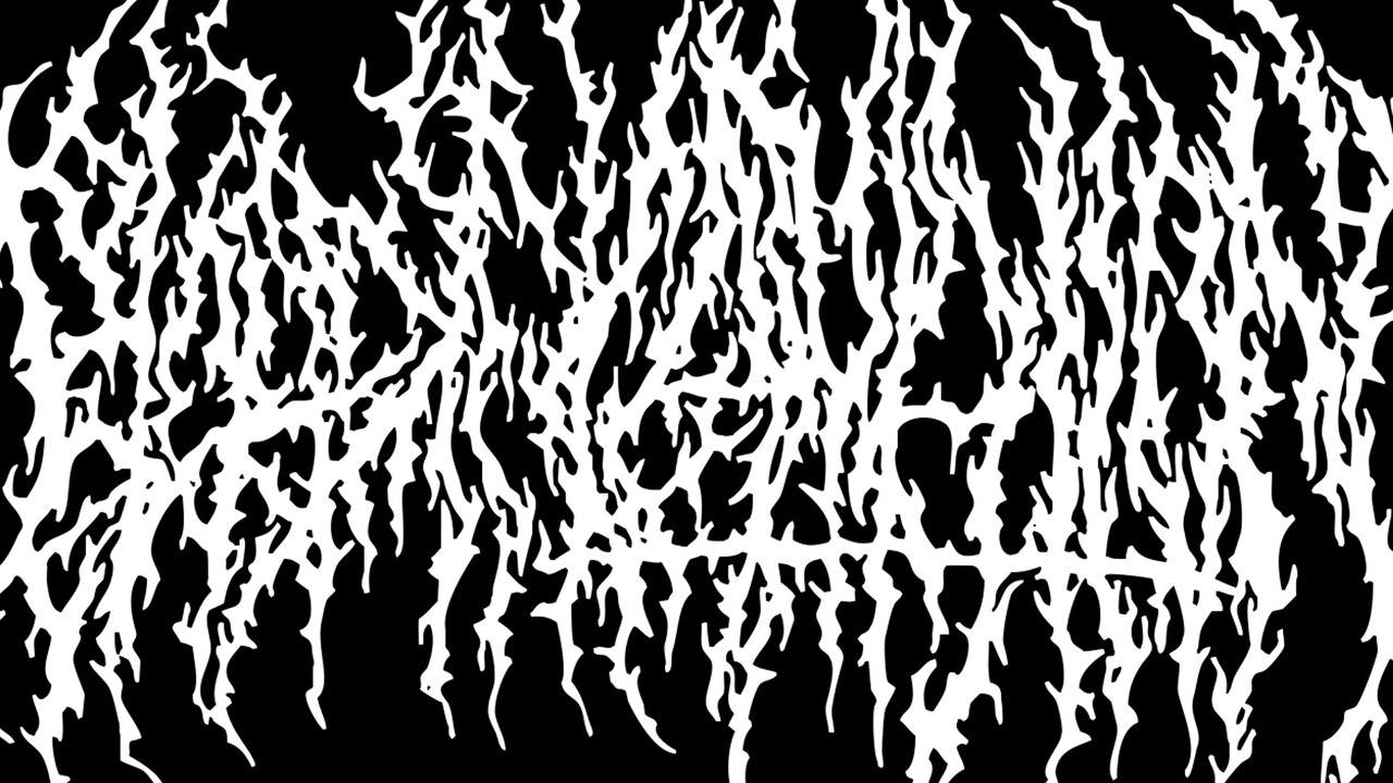
What is this? Anybody know?
A scratched-out mistake? A pile of twigs?
Would it surprise you to know it’s a registered trademark?
This is the logo for the American death metal band Blood Incantation. Yes, it does actually say that… allow me to demonstrate:

It does require a bit of interpretation but a lot of the letters are fairly clear when you spot them amidst the murk. Bonus points to the designer for the two inverted ’T’s!
Logos are as important a factor to metal bands as they are for businesses – they still hold the same uses as they do for any traditional commercial entity: identity, personality, values and content. Which is surprising considering what that content may be for metal bands – as anti-commercial and anti-mainstream as it’s possible for music to be.
Metal music has evolved over the past 50 years from its humble beginnings in Birmingham in the mid-1960s into one of the biggest worldwide sub-cultures in present-day. It’s easy to identify a typical metal fan: black t-shirt sporting a band logo or album cover, long hair, tattoos, denim, leather, band patches. It’s a uniform of sorts; a cultural identifier; particularly relevant for other metal fans themselves. Every metal fan in existence has struck up a random conversation over the shared love of a band one of them is wearing the t-shirt of at the time – it’s impossible not to because of the enthusiasm, passion and community the sub-culture possesses.
This kind of identification goes deeper. Over the years, metal has forked, then branched into myriad sub-genres which have their own aesthetic and of musical signifiers. Band logos are an important facet of this. I put it to you that any established metal head could, fairly accurately identify what a band will sound like, what sub-genre they occupy, even the lyrical content and production values of the music just from looking at the logo. Let’s take ‘black metal’ as an example.
Black metal evolved from late 70s and early 80s keystone bands such as Celtic Frost, Venom, Merciful Fate and Bathory who all toyed with occult symbolism, darker imagery, gothic elements and often anti-religious sentiment. It crystallised into its own definable sub-genre in the early 1990s under bands like Darkthrone, Emperor and Mayhem. Stylistically recognisable by its fast tempos, repetitive higher frequency riffs and shrieked vocals. Black metal also heavily relies on creating atmosphere rather than traditional melody or structure. Aesthetically, it’s easily recognised by low quality, high-contrast black and white imagery, both gothic and organic elements and band members wearing the ubiquitous ‘corpse paint’. Here’s a classic example:


Above is the logo for the English band Venom, created around 1981. Musically, Venom were still very much a ‘heavy metal’ band akin to Iron Maiden rather than anything more extreme sounding, especially by today’s standards. Their music belied their outward aesthetic but they were a seminal influence on many important bands in bringing, what would later be classified as ‘extreme’ metal, forwards. This logo is very stylised and clearly hand-drawn yet legible. It portrays aggression and negativity; it’s stark and occultist. You could argue there’s a folkloric element included with the intertwining lettering being reminiscent of Celtic and pagan symbolism.

Fast forward to 1987. This is the logo for Norwegian band Mayhem, easily the most notorious black metal band, if not THE most notorious metal band to exist. Their story is a truly fascinating part of the history of metal but not something to get into here! The logo is incredibly recognisable and a clear evolution of Venom’s; it’s stark, monochromatic and aggressive. It ramps up the occult symbolism with bat wings and inverted crosses; every point possible has some kind of claw or thorn. It still uses an extra keyline around the logo as Venom’s does which gives it a chaotic feel. Here we also start to see something crucial to metal band logo design – symmetry. Apparently this one was originally drawn on the back of an envelope!

Darkthrone are arguably the most well known and enduring black metal band; certainly they had a huge part in defining the core sound and aesthetic of the genre in the early 1990s. Their logo takes the claws and thorns of Mayhem and twists them into more organic forms; something even more chaotic and creepy. It’s again edging into symmetry with various barbs mirroring each other for vicious effect. It still incorporates blatant symbolism with the pentagram nestled above the lettering amidst the thorns. While the lettering is becoming illegible, the overall shape is hugely recognisable and this move into eschewing legibility would be hugely influential in defining future styles.

Yet another Norwegian band; Emperor. This logo was designed in 1993 by a professional designer. Here we really see symmetry coming to the fore, which becomes an important stylistic feature of extreme metal logos. It’s gothic, stark and features all the pointy bits of Mayhem’s and Darkthrone’s logos. But here there’s more precision, more focus and more intent. It puts Emperor forward as a more serious and professional proposition, both musically and conceptually as the genre evolves. While Mayhem and Venom were fairly schlocky and absurd in their musical extremity, Emperor were serious and upped the ante on how black metal could be more sophisticated and accomplished and this is clearly represented in their logo, especially in the context of their peers.

Wolves in the Throne Room are a contemporary American band whose logo was created around 2005. Black metal is now fully established and is being pushed even further into different territories. This logo encapsulates elements of all which has gone before but pushes those elements further. We have the symmetry and the sharp, gothic flourishes and cleaner lines of Emperor’s logo; the barbs of Mayhem’s, the chaotic tendrils of Darkthrone’s. It’s all that but made into a unique mark. The illegibility cloaks the name of the band but the shape itself becomes the identity, just as the Blood Incantation logo we began with.
There is a strong ‘horror’ thread running through these logos and of course metal has many parallels with horror movie imagery and subject matter as the genre went a long way to influencing metal in the first place and still does so. The progression demonstrated above is a clear example of how increasing complexity and even illegibility have successfully become a key signifiers of a sub-culture. Here the overall shape is what you recognise; whilst the name of the band is still important, the identity of words themselves don’t matter.
Funnily enough, our brains read in a similar manner. When you become an experienced reader, your brain doesn’t take in the individual letters of each word you’re reading, it recognises the shape of the word as a short cut, or heuristic. There is something called transposition where you can swap the middle letters around within a word and it’s still entirely understood, even while reading full paragraphs of transposed text. It proves that letter position is flexible. You’re looking at the shape of the word and your brain recognises shape and context. It’s why new longer words, or foreign words are difficult to pick up initially.
Let me briefly show you one more set of examples to illustrate how all these logos fit into a cohesive whole yet are distinct enough in their identity to be recognisable as a separate sub-set. Here we have 4 logos from ‘death metal’ bands.

Beginning with Slayer’s logo, we can see similarities with the early black metal examples; it’s hand drawn, it employs blatant occult symbolism, it’s bold and obvious and sends clear message of aggression and evil intent (let me clarify that Slayer aren’t technically a death metal band but they were arguably the biggest influence in the genre’s beginnings). With Morbid Angel’s logo we start to see a divergence; the exaggerated points are there but they’re much less organic and more blade-like; they’ve become weapons. Dismember’s logo takes Morbid Angel’s points and extrudes them into a vicious rusty blade of a motif. The symmetry here is striking too. This logo was a clear step into crystallising the style which would distinctly become ‘death metal’. Here you’re introduced to death metal’s torture chamber rather than black metal’s desolate forest at midnight; no less frightening but a much different aesthetic. Defeated Sanity then take this to extremes: they want you to know they are the essence of their chosen style while being the most brutal and the most uncompromising.
Both sets of logos share clear influences; horror, illegibility, symmetry and degraded, chaotic aspects, but it’s the nuances where they diverge. The death metal logos are blade-like rather than of root or thorn; they’re bold and to the point rather than wraithlike. Because of these nuances, a metal fan can distinguish a black metal band from a death metal band fairly easily. We can also directly see visual style evolving alongside the musical style.
All of these bands are extremely popular in the metal community and whether you like them or not, it’d difficult to argue against their creativity, vision and influence within the scene. Aesthetically, both threads are examples of how simplicity isn’t always better or a route to success or acceptance within the right context. The illegibility is shocking at first but the shape itself becomes the mark; even colour is a secondary aspect, allowing the stark form itself to lead. It shows how a unique mark can still be created even while conforming to quite a specific genre whilst fitting into a broader aesthetic. Despite the relative bizarreness of Blood Incantation’s logo shown earlier, it’s still very recognisable within the scene.
They’re all examples of imbuing a mark with meaning without resorting to oversimplification. They all possess the qualities of what they’re trying to convey and there’s also strong history of music and culture contained in these marks which metal fans recognise and appreciate. All without being able to easily read them!
A logo should convey personality and if ultimately, brand logos become homogenised, does that mean that brands all have the same personality? Perhaps we could take influence from more underground culture and re-think the trend of oversimplification. It’s variety and difference which make life more interesting after all.
Account Manager at JGM Agency
6moAndrew Stanford
Graphic Designer at APS Group / School of Thought Alumni
6mo🤘🏽 Dio would approve